One of my very first freelance projects involved designing packaging for Tombow, a Japanese office supply company with a large international presence. I worked with the brand manager to create packaging that was fun and approachable for their new line of pens aimed at casual handlettering enthusiasts. This packaging can currently be found at Michaels, Amazon, and art supply stores.
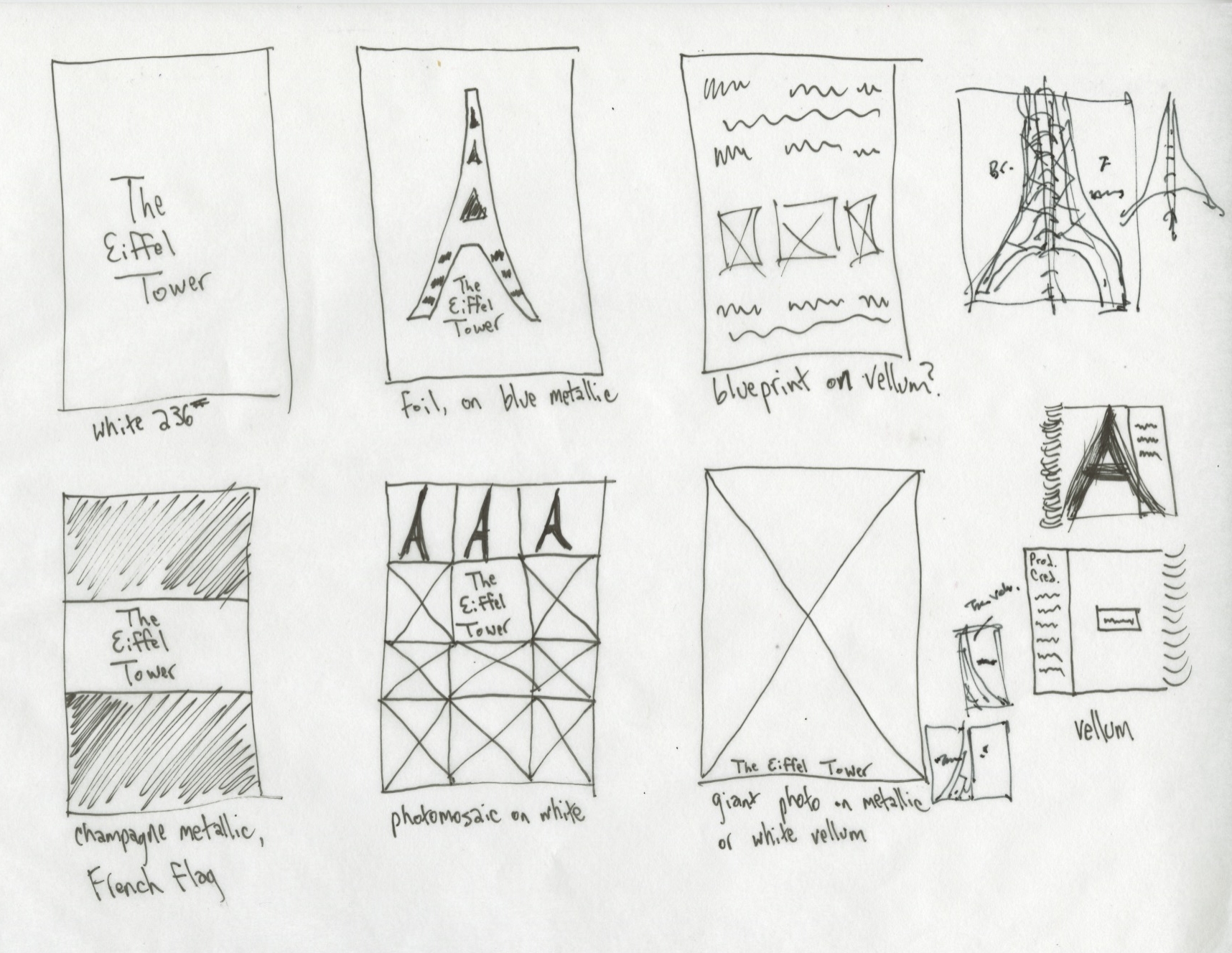
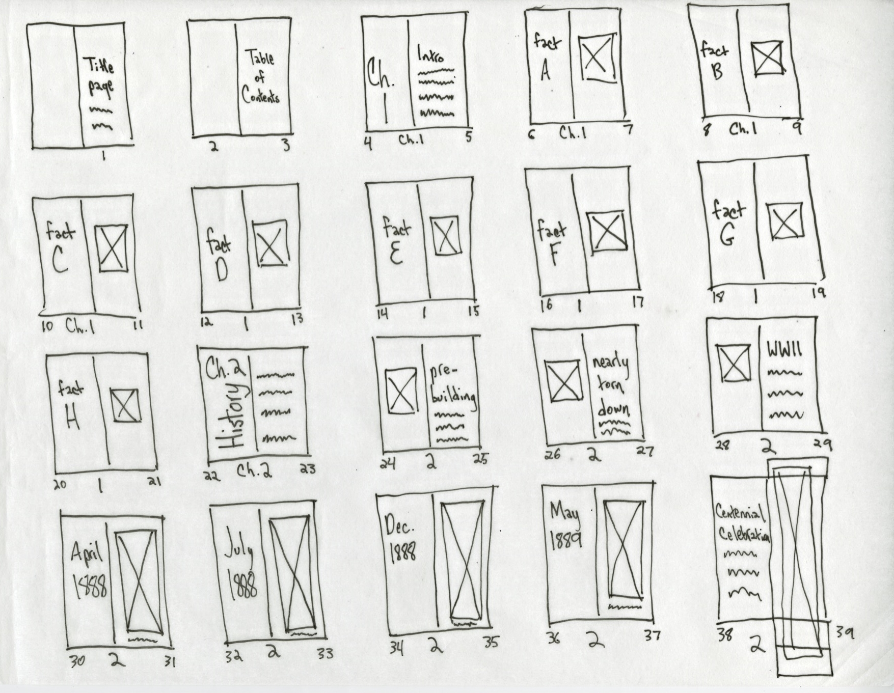
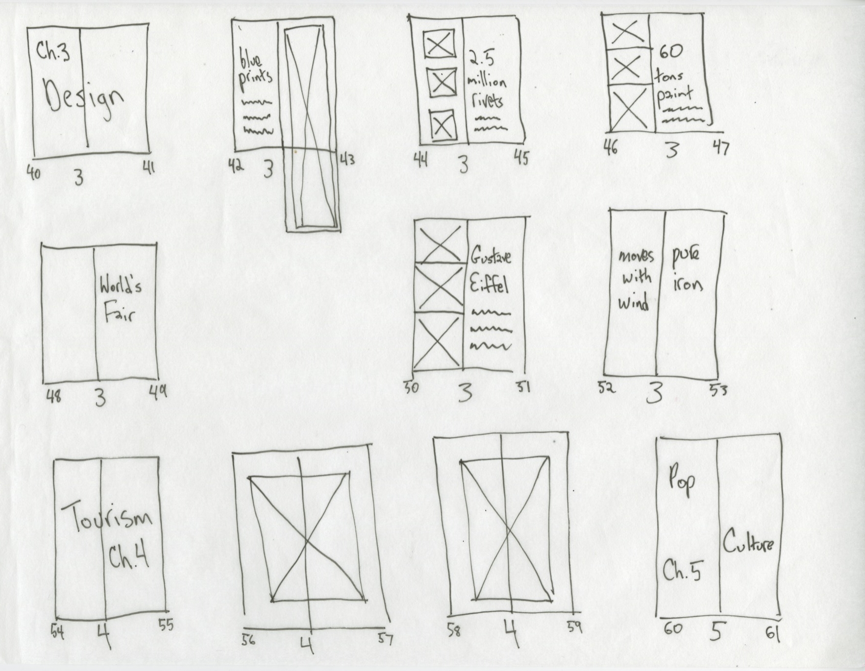
I created a promotional book featuring the Eiffel Tower to showcase Reich Paper's products. It includes special finishing such as die cuts, foil-stamping, and foldouts. All finishing and binding were done by hand.
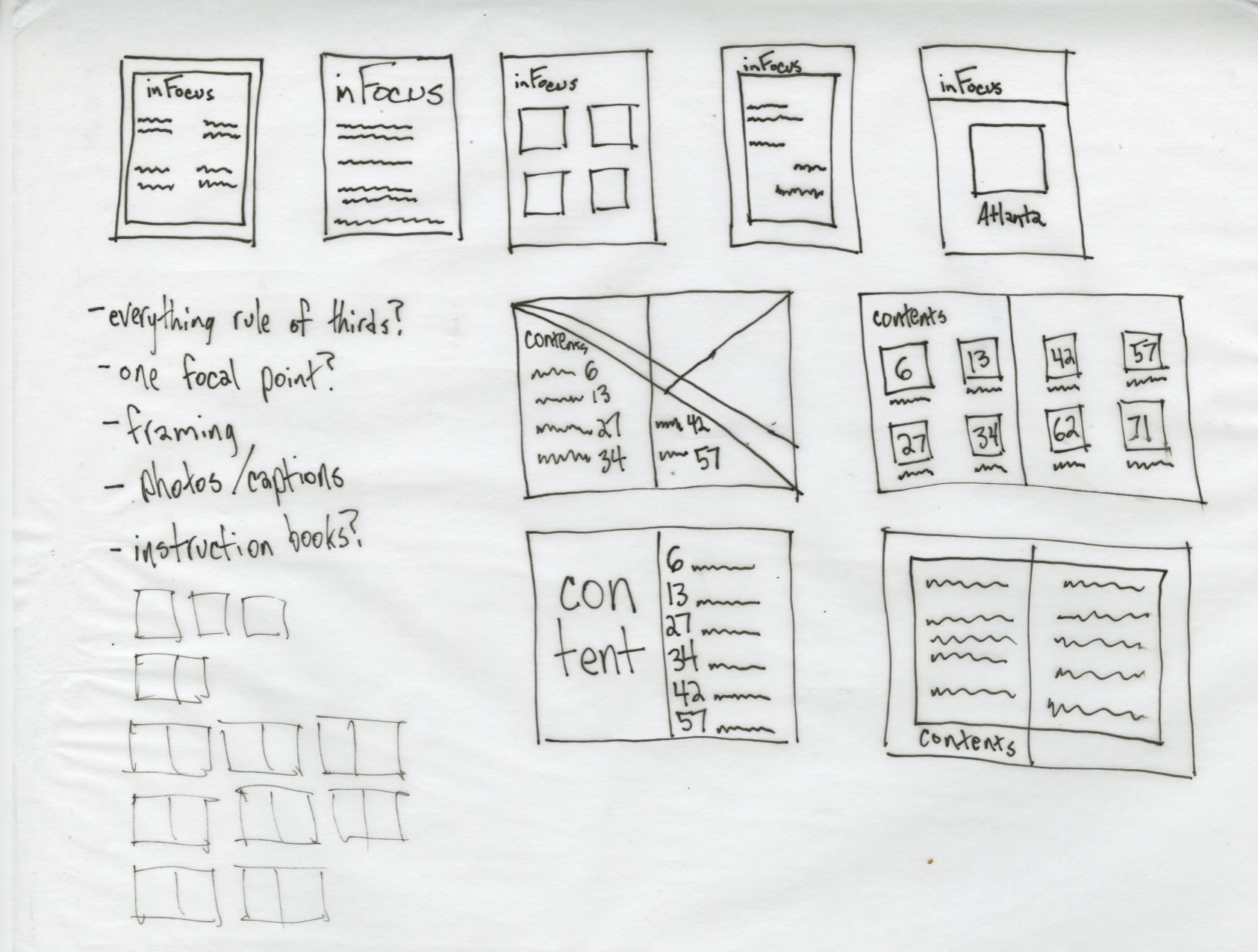
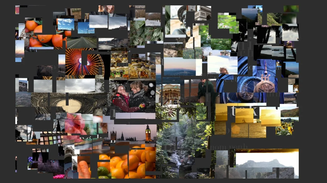
CROP is a magazine I created, aimed at amateur photographers in their twenties and thirties. All photos were taken by me.
I created a motion piece for The Travel Channel, to assist in realigning the network for younger (18-34) female viewers. All photography used in the piece was taken by me.
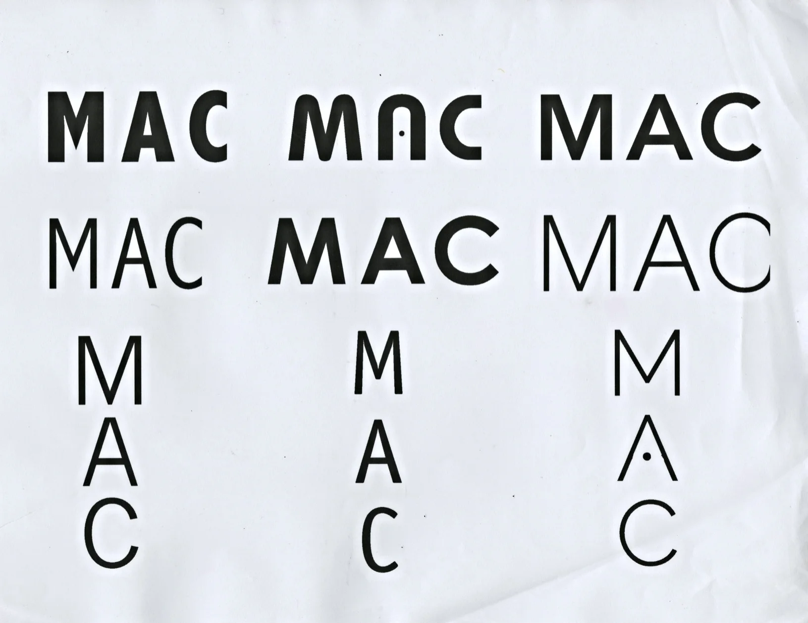
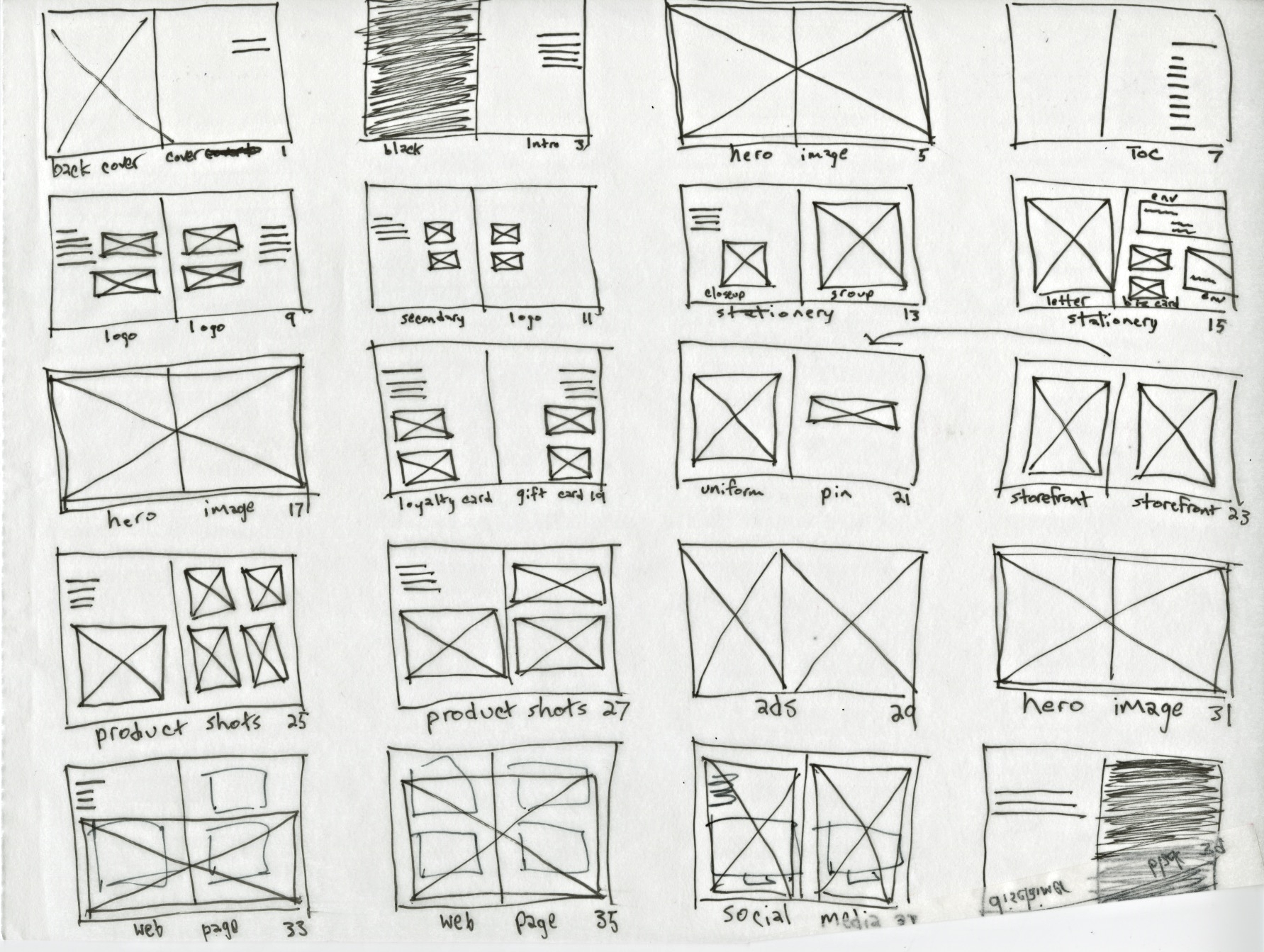
I created a logo redesign for M.A.C. Cosmetics. The replacement logo was intended to be a sleeker, more modern version of the original, which had not been updated since the brand's inception. The challenge was coming up with something fresh and different while still maintaining the recognition value of the ultra-iconic original logo. The primary logotype shows the updated type while retaining the spirit of the original, while the secondary mark is the fusion of all three elements in the primary - keeping M.A.C.'s focus on inclusion front and center. The redesign included a new stationery system, website, and updated packaging and storefronts.